Honey

Communication and promotion strategy FAIRTRADE – CLAC

Campaign
Design

The main challenge that was found was to brand the honeys in such a way that they are unique and attractive, different from honeys from other regions. At the same time, it was also challenging to come up with two words to summarize the phrase “Fairtrade Honeys from Latin America”.

After several tests, it was agreed to use the claim: “Latina Honey” or “Latina Honig” in German. 

“Latina or LatinA” as a means of summarizing an attribute and a place that can be associated with honey, with all that this phrase implies, in terms of its ability to surprise and be globally understandable. 

It was tried just with Latin, but it was discarded due to its low impact and ambiguity. That is why Latina was chosen, because it is clear, imaginable and pleasant.

The ambiguity of using the A for America in LatinA in the design is still a small resource that will allow us to explain the presence of America.

What does this name convey to us? It marks an origin and attributes that exist today and which are understandable to the markets we are targeting.

The brand

The brand of the campaign is an advertisement in itself, since its image portrays the green world linked to bees and honey for anyone who sees it, without distinction of the spectator’s culture of origin.

The text, the word Latina Honey, defines the denomination of origin as it is only a product of our region. The letters of the identity are friendly, lowercase and specially drawn with a brush, using honey as ink.

This resource of using honey as a writing medium allows us to include more of the material nature of honey in communication.

Then, the planet that contains the phrase, shows the biodiversity and the existing internal relationships, such as the presence of birds, flowers and trees with different shapes, typical of a scenario that arises from the promise of sustainability and biodiversity.

The typography of the claim “Healthy for the planet, healthy for you”, is the one used today by Fairtrade on its site, since we want to control the integration of this message, together with the corporate aspect of the organization.

A second supporting tagline will be “By consuming Latina Honey, you are helping biodiversity”.

This complement will be used in those cases where we can present the reasons why we are so straightforward in our statement.

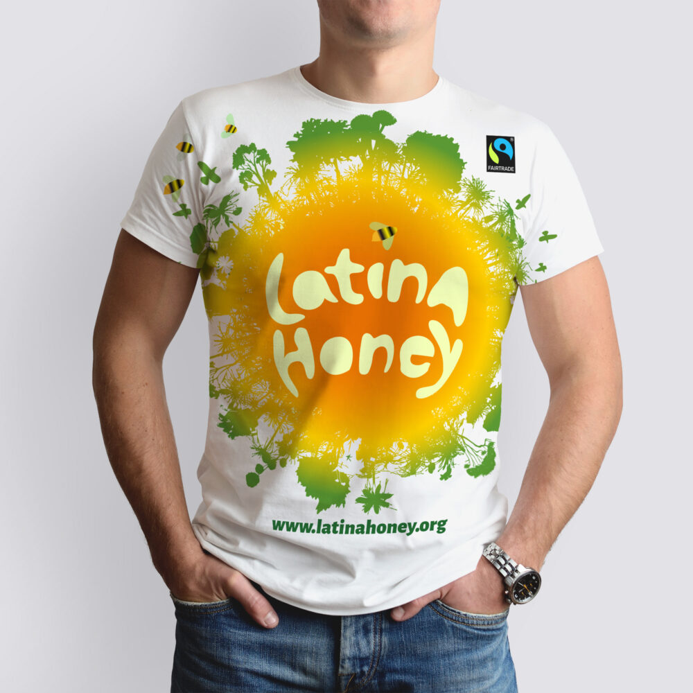
The selected colors seek to create an optimistic climate and scenario for the message.

Either on a black background to highlight the colors, or in most cases, on  a white backdrop, the green, the orange and the yellow, do not only connect the brand with the honey golds, but also, on the periphery of the image, they include the greens of the environment, both fields separated by a light yellow, so as not to overlap both perceptions.

As a complement to the new brand, the Fairtrade brand is applied, received from the new identity manual.

This application is suitable for the campaign, since all the communication resources used intend to seek the concrete result of opening markets and sales opportunities for CLAC-Fairtrade honey in their markets.

The image of the planet is designed to be the protagonist.

It is designed to be displayed in a large size then making this message central in the agenda of its viewers. It seeks to attract attention.

Subscribe to our Newsletter

Fill in the form below to book a 30 min no-obligation consulting session.

I will reply within 24 hours.